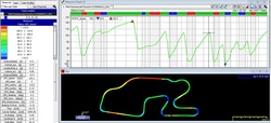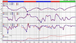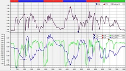
 Just like we looked at a couple of Featured Articles ago, some people like graphs and some people like video. Well, some folks like to look at a track map and have data over-layed onto it. This is most commonly done with colors – you know – those colorful rainbow maps with the different bands.
2 Comments
 Does it make sense to put a $400 AiM SOLO in a $500 Lemons race car? Of course it does! Within our small team of 5 folks, we were each able to improve our individual lap times by comparing our speed, longitudinal G, and lateral G force graphs. Throw in the ability to use the GPS features to compare our driving line and we had one teammate lose over 3 seconds on a one minute 31 second lap. That is a serious improvement!  Sometimes we just need to look at things a little differently to reinforce what we’re seeing. Even though two different style graphs are showing the same information, we can get more out of one. It’s important to remember this when we’re looking at our data. Remember to look at things multiple ways to see which makes the most sense to you and is the most helpful. |
Featured ArticlesHere is a collection of articles from some of the best professional coaches, drivers, and data engineers. Archives
May 2017
Categories
All
|

 RSS Feed
