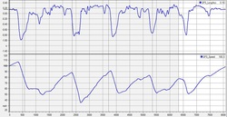
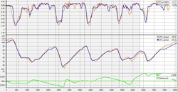
The second spot to look is your longitudinal G Force. It should show a similar nice, sharp transition from a slightly positive number as you were accelerating to a large negative number as you started braking. The more rounded the transition from positive to negative, the more time that is being taken to go from throttle to brake. This is “lost” time when you are not accelerating or really slowing down.
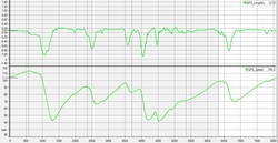
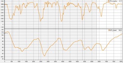
We all know that we’re supposed to go from throttle to brake quickly, but many times this doesn’t happen. And we are not talking about the a high speed corner with a lift, we’re talking about an end of the straight hairpin or other medium to low speed corner. This is when the little bits of coasting can cost us lots of time. Luckily, this is one of the easiest things to find in data plots. When you start checking out your data, take a look at the MPH plot first. How sharp of an angle do you have when the graph transitions from increasing to decreasing? Is it nice and sharp showing a quick transfer from accelerating to braking or is it rounded over from coasting? An easy way to think of it is this – good plots look like sharp peaked mountains. Think of the Rockies. Bad plots look round – like the rolling hills of Kentucky. The second spot to look is your longitudinal G Force. It should show a similar nice, sharp transition from a slightly positive number as you were accelerating to a large negative number as you started braking. The more rounded the transition from positive to negative, the more time that is being taken to go from throttle to brake. This is “lost” time when you are not accelerating or really slowing down. The first graph in green show an extreme example of coasting. Staring with the MPH graph on the bottom, you can see large, rounded transitions from the accelerating portion of the graph to the braking portion. The first one occurs at approx. 500 feet as noted at the bottom of the graph. This is mimicked in the longitudinal G graph above it. When looking at the first corner (starting at approx. 500 feet) notice in the long. G. graph that the trace goes from a positive value of around .1 G to a -.1 to –1.0. The little bit that is -.1 is the coasting area. For an example of better transitions, take a look at the orange graph. It’s from a different track, but is a good example of better braking. Notice the mph peaks are sharper, along with the transitions from positive to negative long. G forces. This trace shows better transitions from throttle to brake. Now, for an example of even better transitions, look at the blue graph. You’ll see all of the transitions from accelerating to braking are much sharper. This is a good transition from throttle to brake, taking a minimum of time. You’ll also note that the long. G trace shows sharp transitions from accelerating to braking. When you compare the orange and blue graph you’ll see the blue graph is slightly better in the transitions from throttle to brake. While the difference is not huge, it’s worth at least a couple of tenths per lap. Tenths that are free for the taking…
1 Comment
|
Featured ArticlesHere is a collection of articles from some of the best professional coaches, drivers, and data engineers. Archives
May 2017
Categories
All
|