
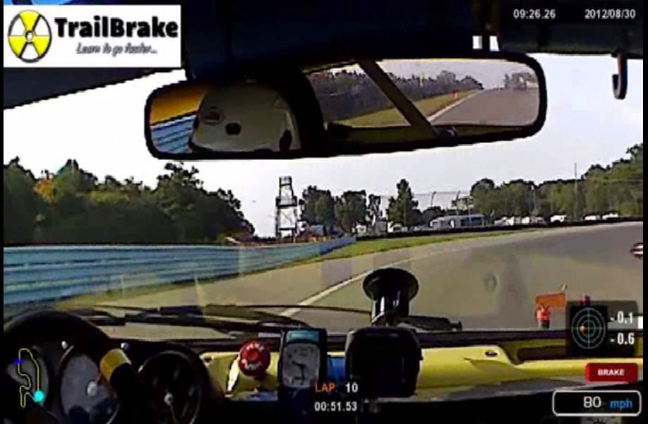
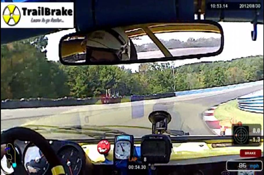
Everyone knows the old adage “A picture is worth a thousand words.” In data, we use all kinds of pictures – regular graphs, XY plots, histograms, and many more. Those graphs, while technically pictures, sometimes lend themselves to those with a “math mind.” When we add video to the data, it really adds 1,000 words.
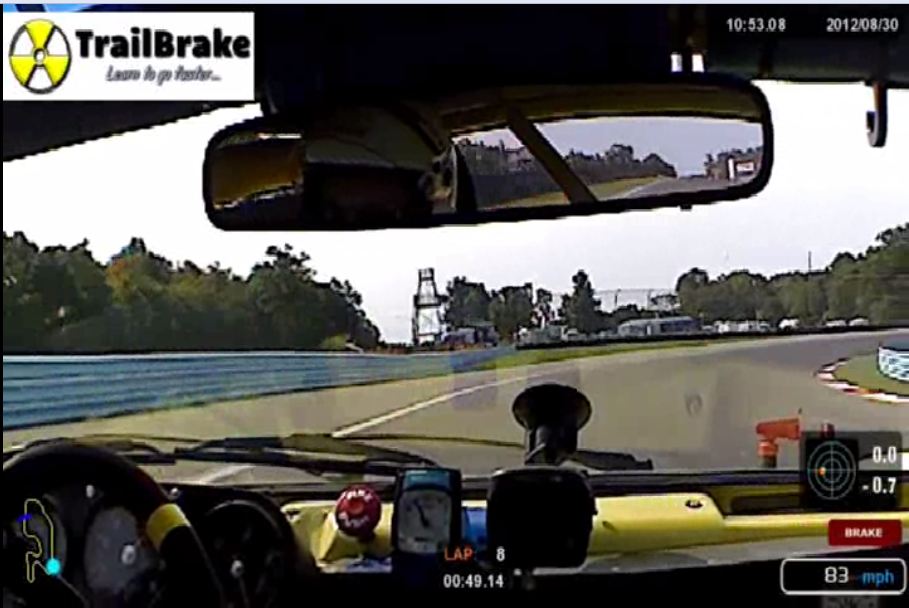
I’m a real numbers / graph kind of guy. I can look at graphs and see what the car is doing, what the driver is doing, and on a good day I can tell why it’s all happening. My co-driver is not. She is a visual person, but likes video. She will study the video, see what I’m doing, and then look at what she is doing in the same spot. She will even take notes off the video – speeds at turn in, apex, track out. She also note G loads to see if we are braking and/or turning the same.
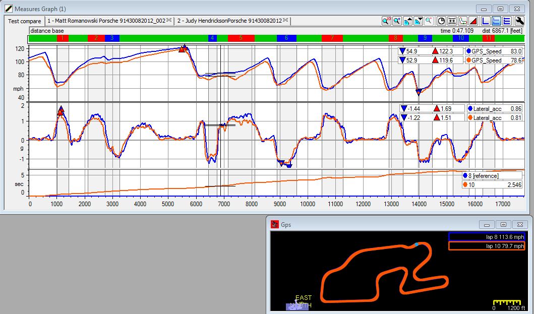
Check out the photos – the first is the graph for the two sessions we are comparing. All of the info is right there, but you have to get it out. You can see the point where the turn in to the Outer Loop begins and the speeds through the entire corner.
Check out the photos – the first is the graph for the two sessions we are comparing. All of the info is right there, but you have to get it out. You can see the point where the turn in to the Outer Loop begins and the speeds through the entire corner.
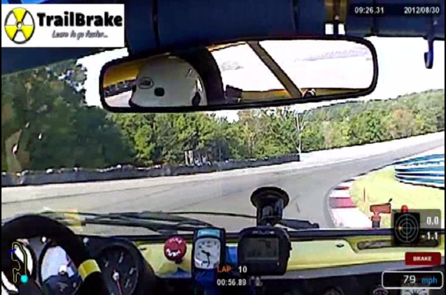
The section we are looking at is the exit from the Bus Stop going into the Outer Loop (Turn 5). Check out the differences in speeds and G loadings. You can see the faster driver is maintaining speed while the slower driver is actually decelerating and carrying less lateral G.
The situation hasn’t changed too much by the time we both make it to the apex. You can see that I’m doing 6 mph more and pulling .2 more lateral G. While this is all easy to see in the video, comparing the video makes it a little easier to see and compare. The video also makes it easier to see how I approached the corner and to compare our car placement.
You can check out the whole video of both laps below. Which method do you like? Video? Data? Both? Let’s hear something in the comments.
 RSS Feed
